Your hero section is the first thing anyone sees on your site, and it’s doing more work than most people realize. In a couple of seconds, it needs to set the tone, say what you do, and make someone want to keep scrolling.
This is the first post in a series where we’ll break down modern layout ideas for every section of your site. We’re starting where every visitor starts: the hero.
For each layout below, we’re showing two versions. First, a lo-fi wireframe, so you can see the structure without getting distracted by styling. Then, a hi-fi version, so you can see how that same structure looks once fonts, colour, and imagery are applied. Think of the wireframe as the skeleton and the hi-fi version as what it looks like fully dressed.
1. The full-screen statement hero
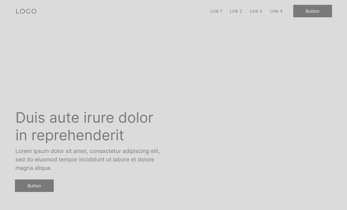
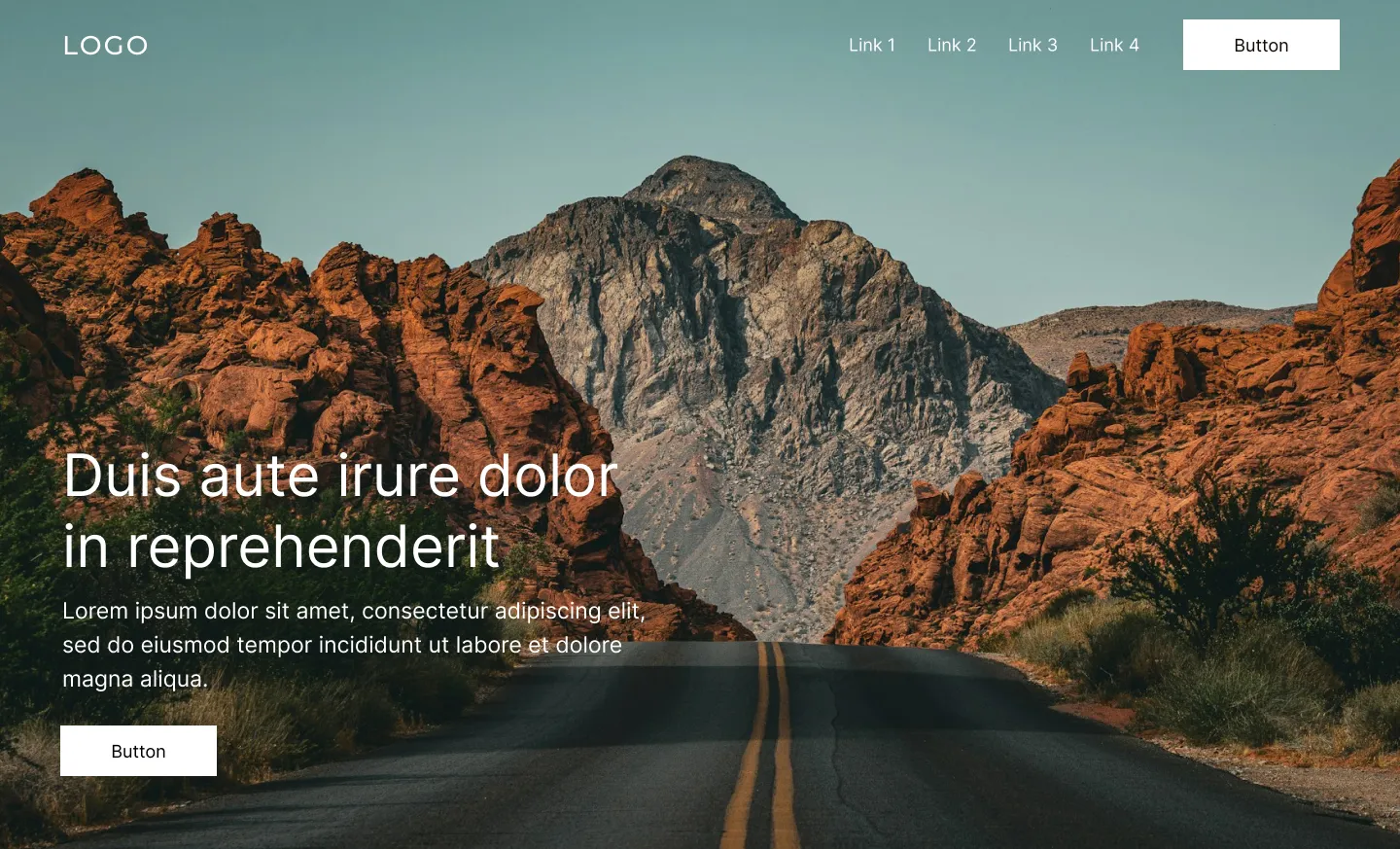
One image or video fills the entire screen, edge to edge. A short headline and a single button sit on top. That’s it. Your navigation fades into the background, the next section disappears below the fold, and for a moment, it’s just the visitor and your photo.
There’s nowhere else for the eye to go, which is exactly the point. But that also means this layout has nowhere to hide. If your photography is strong, it looks incredible. If it’s mediocre, everyone will notice.
This is also the layout where we see clients get into trouble most often. It usually starts with wanting a full-screen photo and a headline, then a subheadline gets added, then a paragraph explaining the offer, then a second button just in case. By the end, the image is barely visible under all the text, and nobody can tell what they’re actually supposed to click. One or two lines and a single button is the whole formula. If you’re explaining more than that, it belongs in the section below the hero, not on top of the image.
The other common misstep is the video version of this layout. A background video looks great in theory, but if it’s uploaded directly instead of hosted through Vimeo or YouTube, it can quietly tank your page speed. Visitors won’t wait around for a slow-loading hero, and neither will Google.
Why it works: Nothing competes for attention, so the message lands faster, as long as you actually let it stay that simple.
Best for: Photographers, hospitality, wellness studios, and any brand where the photo does the selling.
Build it in Squarespace: Use a full-bleed image or background video section, keep your text centred or lower-third aligned, and stop at a headline, one line of supporting text, and a single button. If you’re using video, host it on Vimeo or YouTube rather than uploading it directly. Adding more just gets in the way.
2. The split-screen hero
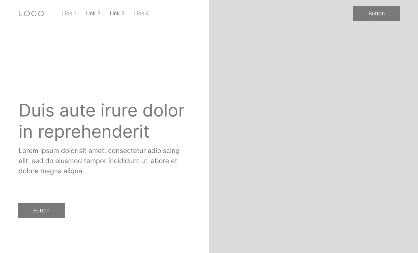
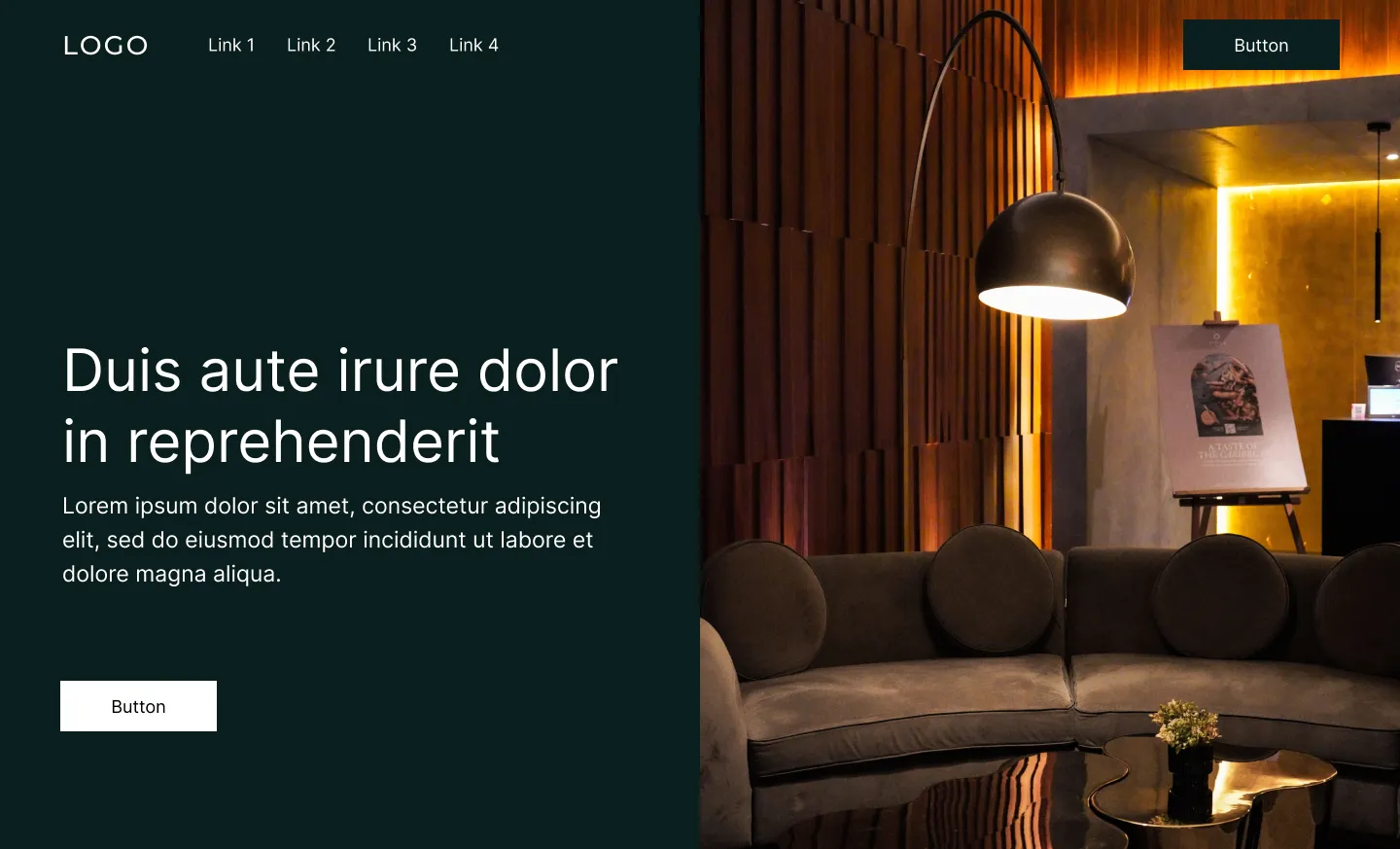
Image on one side, headline and text on the other. Clean, even, no overlap. Each half gets its own space to breathe.
It’s a favourite for service businesses for a good reason: you get a real photo of yourself or your team without burying your message underneath it. Both things get equal billing.
Why it works: It balances a visual and a message without either one drowning out the other.
Best for: Service businesses, coaches, and consultants who want a professional feel with a real photo included.
Build it in Squarespace: Fluid Engine handles this well. Drop an image block on one half, a text block on the other, then check your mobile layout separately since you’ll usually want them stacked instead of side by side on smaller screens.
3. The editorial hero
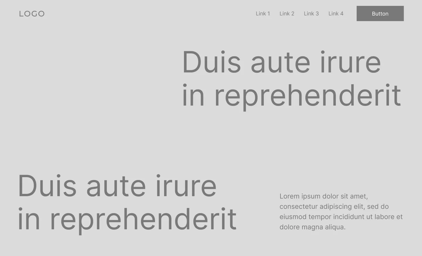
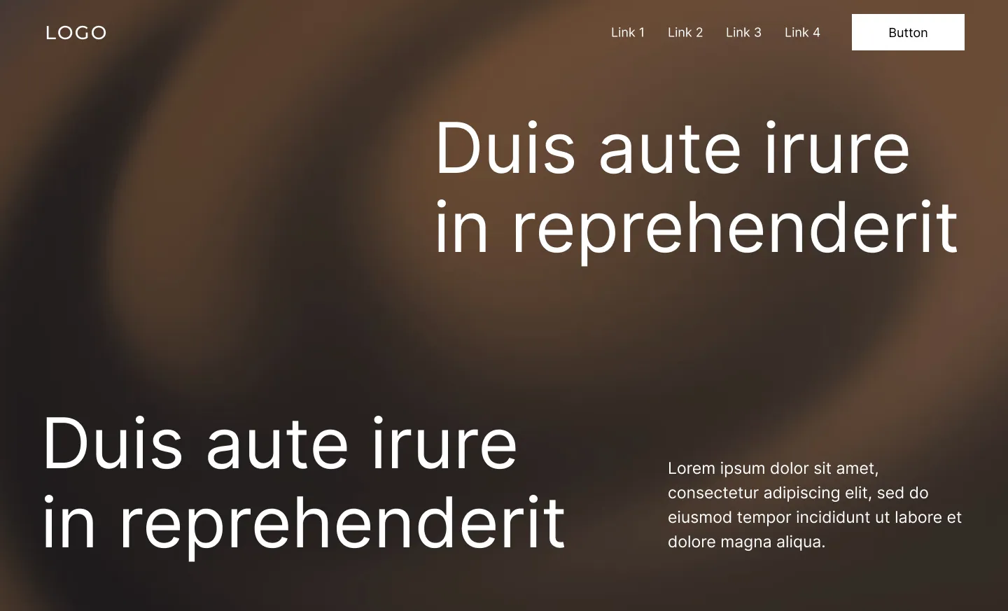
Big, bold type takes the lead here, sized large enough that it becomes the visual, not just the message. It can sit on a clean flat colour, or on a soft abstract background like a gradient or blurred texture, either way, the type stays the focus, not a photo of your product or team.
This one’s become a shorthand for confidence. It tells a visitor your message doesn’t need a literal picture to back it up. It also tends to be one of the faster-loading hero styles, especially in its flat-background version, since there’s no large photo file for a visitor’s browser to download before the page feels complete.
Why it works: It’s bold and distinctive, and it doesn’t need a photo to carry the message.
Best for: Brands with a strong, distinctive font, or a message confident enough to stand on its own, without a supporting image.
Build it in Squarespace: Pick a heading font with real personality and size it bigger than feels comfortable at first, most people go too small. Choose a flat background colour for a clean, confident feel, or a subtle abstract texture if you want a bit more depth without pulling focus from the type itself.
4. The asymmetrical grid hero
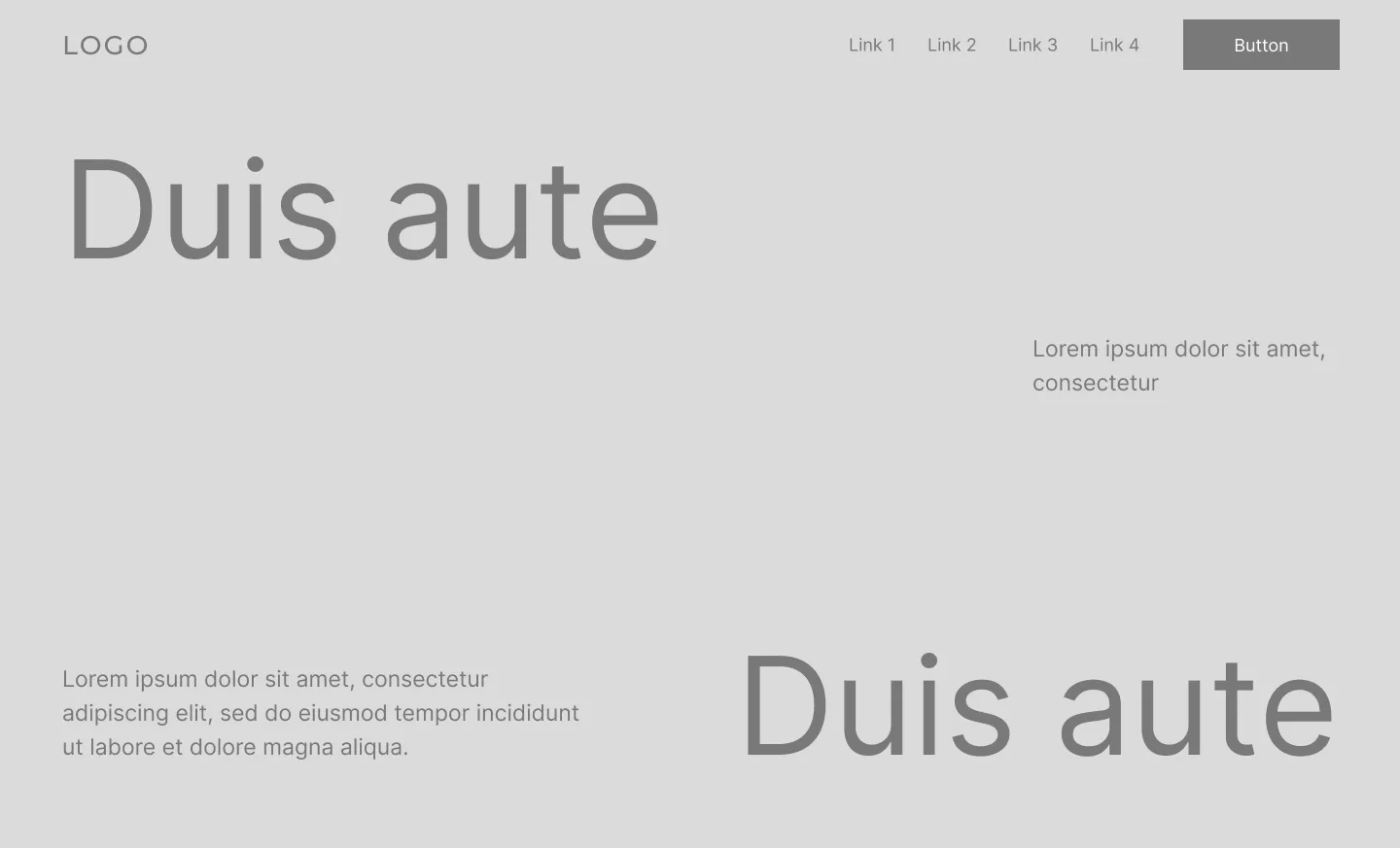
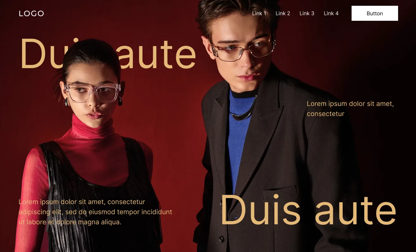
Nothing’s centred. Nothing’s evenly split. A smaller image sits off to one side, the headline shifts away from the middle, text and photo elements layer and overlap rather than sitting in neat, separate boxes.
Most people centre everything by default, so a deliberately offset, layered layout immediately reads as more current and less templated. It also gives you more room to build real hierarchy, since elements aren’t all fighting for the same spot in the middle of the page. This is often where a hero starts to feel more like a designed magazine spread than a standard website banner, headlines crossing over the edge of a photo, captions tucked into a corner, nothing lined up in an obvious grid.
Why it works: Breaking the centred default, and letting elements overlap intentionally, makes the whole layout feel more contemporary and considered.
Best for: Creative agencies, personal brands, and fashion or lifestyle businesses that want their site to feel distinct from more traditional competitors.
Build it in Squarespace: This is where Fluid Engine’s 24-column grid and overlap tools really shine. Fight the urge to centre everything, shift your headline off to one side, or layer a text block partially on top of an image at a different size to break the symmetry. If you do overlap text and image, test legibility carefully on both desktop and mobile before calling it finished.
5. The layered card hero
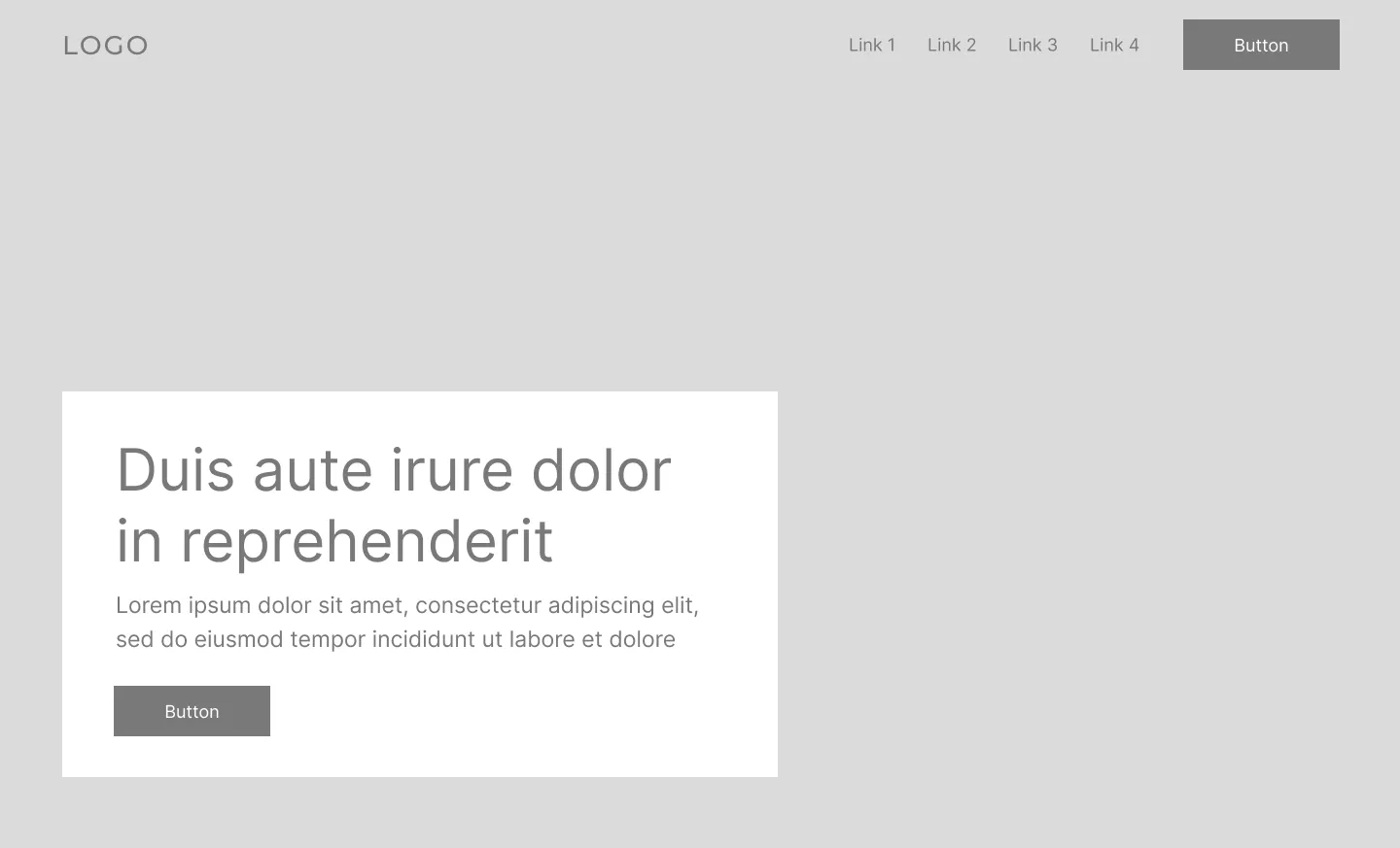
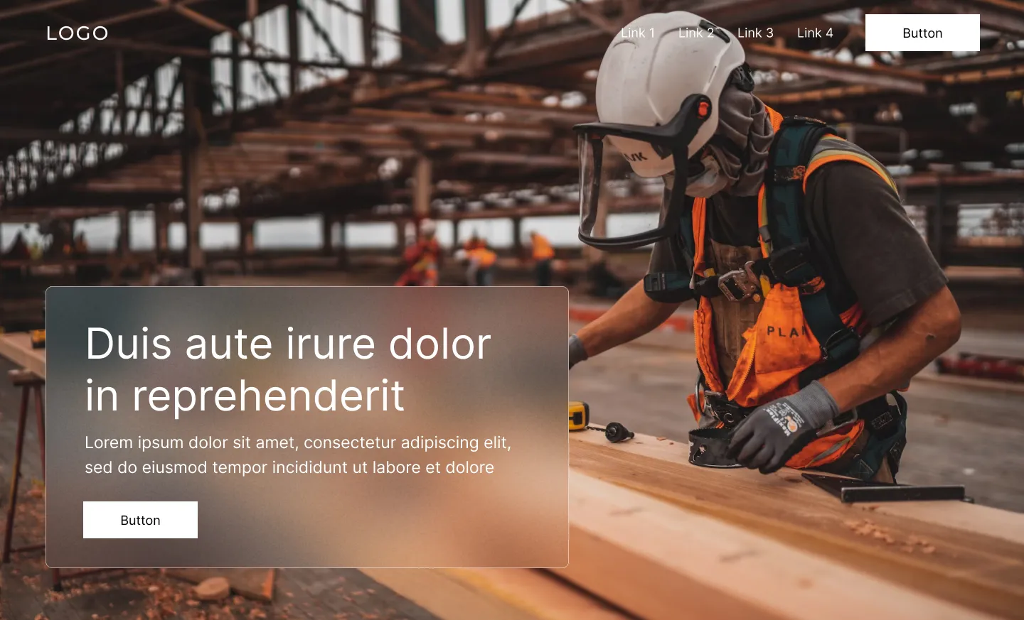
A background image or colour fills the section, but your actual message sits inside a smaller card layered on top, rather than floating freely across the page.
The card’s job is simple: keep your text readable no matter what’s happening behind it. Busy background, high-contrast photo, doesn’t matter, the card protects your message. It also gives the whole thing a cleaner, slightly more technical feel, which is probably why it shows up so often on SaaS and product sites.
The card format tends to invite one specific problem: once there’s a defined space for content, it’s tempting to fill it. We’ve seen this play out the same way more than once. A client starts with one clear button, then wants to add a second option for a different audience, then a third “just to be safe.” A card with three competing buttons doesn’t give visitors more choice, it just makes them pause and figure out which one actually applies to them. One or two CTAs, max, and they should point at two clearly different actions, not two versions of the same one.
Why it works: It guarantees legibility and looks clean doing it, as long as the card stays focused.
Best for: SaaS-style businesses, product launches, and brands going for a polished, technical feel.
Build it in Squarespace: Place a solid-background text block on top of a full-bleed image or colour section behind it. Round the corners if you want it to feel a little less boxy, and resist adding a third button once the first two are in place.
6. The framed or bordered hero
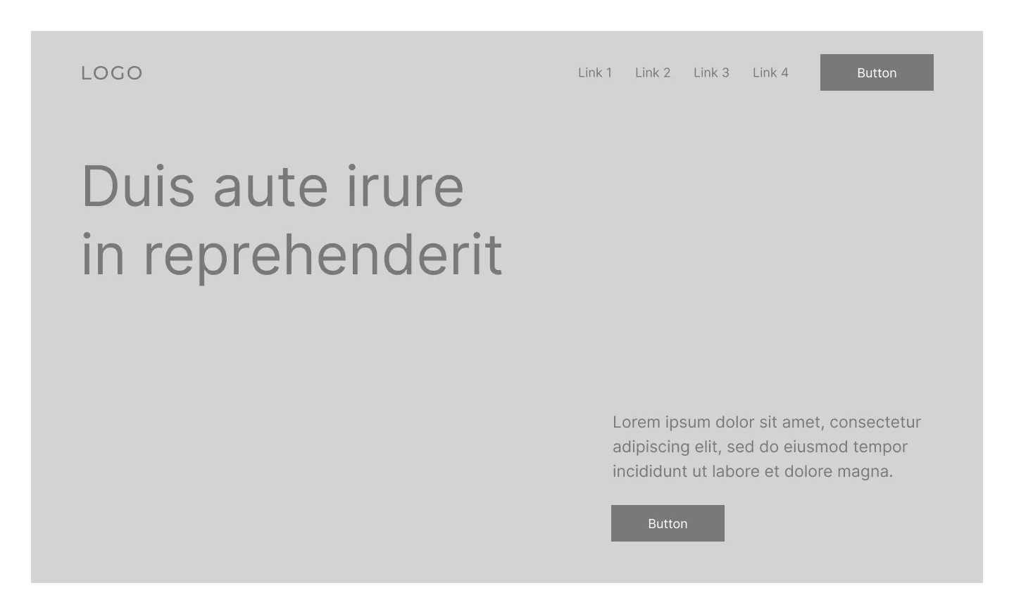
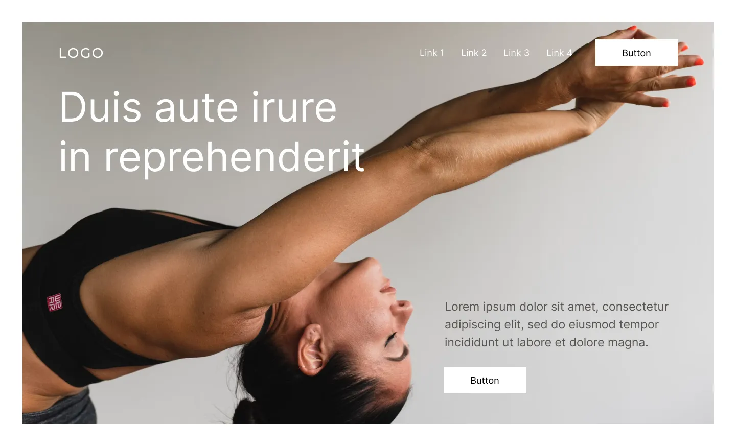
Instead of stretching edge to edge, your hero image sits inside a visible frame or border, with room to breathe around it. Think of a piece hung in a gallery rather than an image filling a screen.
Most heroes default to full-bleed without a second thought, so a visible frame feels like a choice someone actually made. It gives the whole layout a curated, deliberate feel.
Why it works: It stands out simply by not doing what every other hero does.
Best for: Portfolios, creative studios, and brands that want their hero to feel curated rather than immersive.
Build it in Squarespace: Use spacer blocks or a coloured background section to build a visual “frame” around your image, instead of letting it stretch to the edges. A muted background colour that complements the image, rather than competing with it, makes this work even better.
Choosing the right one for your site
Not every layout fits every brand, and that’s the point. A few quick questions to narrow it down:
- Is your photography strong enough to carry the whole hero? If yes, consider the full-screen or split-screen hero. If not, lean toward the editorial hero.
- Does your brand feel more polished and structured, or more expressive and editorial? Structured brands tend to suit the split-screen, framed, or layered card heroes. Expressive brands tend to suit the editorial or asymmetrical grid heroes.
- Do you already have a strong headline or tagline? If your words alone are compelling, the editorial hero lets that message lead.
More sections, more layouts
This is just the beginning of your hero section options, and just the beginning of this series. Next, we’ll look at layout ideas for FAQ sections, contact pages, and About pages, using the same lo-fi to hi-fi approach so you can see exactly how each idea comes together.
If you’d rather start from a template that already has a strong hero layout built in, our Squarespace templates give you a head start, so you’re customizing a great foundation instead of building one from scratch.