Most business owners don’t find out their website is a problem from an error message. There usually isn’t one.
Instead, enquiries feel a little slower than they should. A quiet month gets blamed on the season, the economy, or the marketing budget. Rarely does anyone stop to ask whether the website itself is getting in the way.
Here are seven signs worth checking, and a quick way to test each one yourself.

1. Your site takes too long to load
A slow website creates friction before visitors have even had a chance to see what you offer. Some will leave rather than wait, and they won’t tell you why. They’ll just be gone.
You don’t need to chase a perfect performance score, but your site should feel fast enough that people aren’t waiting for it to catch up.
✅ Quick check: Run your site through Google PageSpeed Insights, then test it yourself on a normal connection and a real phone. If it feels slow to you, don’t assume visitors won’t notice.
2. It’s genuinely difficult to use on a phone
A website can look great on a desktop and still be frustrating on a phone. If visitors have to pinch, zoom, scroll sideways, or struggle to tap a button, you’re making it harder for them to find and use the information they came for.
The best test isn’t another browser preview. It’s using your own website like a customer would, on the device they’re most likely to use.
✅ Quick check: Open your site on your actual phone and try to find your main service, check your pricing, find your location, and contact you. If any of those tasks feel awkward, you’ve found something worth fixing.
3. Your calls-to-action are vague, missing, or buried
“Learn More” at the bottom of a long page isn’t much of a call-to-action. If someone is interested but has to work out what to do next, you’re adding a decision at the moment you should be making things easier.
The right action depends on your business. It might be booking a consultation, requesting a quote, making a call, buying a product, or simply getting in touch. The important thing is that the next step is obvious.
✅ Quick check: Look at each important page and ask, “If I’m interested, what am I supposed to do next?” If you have to think about the answer, your visitor probably does too. One clear action is usually better than six competing ones.
4. Your contact info isn’t actually clickable
If someone finds your site on their phone, decides they want to call, and your phone number is just plain text, you’ve added an unnecessary step between interest and action. The same goes for an email address that doesn’t open an inbox or an address that doesn’t open in Maps.
This isn’t a redesign problem. It’s a usability problem, and it’s often one of the easiest things to fix.
✅ Quick check: On your phone, tap your phone number, email, and address. Each one should do exactly what you’d expect: dial, open an inbox, or open a map.
5. Your site could belong to almost any business in your industry
If a competitor could swap their logo onto your homepage and nothing would feel out of place, that’s a real problem. Generic messaging and interchangeable design make it harder for the right customers to recognize your business as the right fit.
“Quality service,” “customer-focused,” and “professional solutions” might sound good, but most businesses can say the same thing. Your website should quickly make clear who you help, what you do, and why someone should choose you.
✅ Quick check: Read your homepage without looking at your logo or business name. Could someone tell who you help, what you do, and what makes you different? If not, a new colour scheme won’t fix it.
6. It looks like it hasn’t been touched in years
Your website doesn’t need to follow every design trend to look credible. But outdated information, broken links, tired imagery, or content that no longer reflects the business can make visitors question whether the business itself is being kept up to date.
People rarely think, “This website is outdated.” They simply form an impression and decide whether they feel confident moving forward.
✅ Quick check: Look at your site as if you’ve never seen the business before. Is the information accurate? Do the images represent the business today? Do the services still reflect what you offer? Would you trust this business with your money?
7. You’re getting traffic, but it’s not turning into enquiries or sales
If people are visiting your site but enquiries, calls, bookings, or sales aren’t following, don’t automatically assume you need more traffic. First, work out where the journey is breaking down.
Think of it as three steps: traffic → key page → action. If people aren’t reaching your important pages, look at your navigation and content. If they’re reaching those pages but not taking action, look at your messaging, trust signals, and calls-to-action.
✅ Quick check: Look at your analytics and find where people are dropping off. Are they reaching your service pages? Are they visiting your contact or booking page? Are they starting a form and abandoning it? The biggest drop-off is usually a better place to start than simply trying to attract more visitors.
What to fix first
You probably don’t need to fix all seven problems at once. Start with anything that prevents someone from taking action, such as a broken contact path, poor mobile usability, or a confusing call-to-action.
Next, fix anything that makes it harder to understand your business or find the right information. Once those basics are working, look at the details that influence trust, such as outdated content, imagery, and overall presentation.
The goal isn’t to build a perfect website. It’s to remove the things that make it unnecessarily difficult for a good potential customer to say yes.
If you’ve worked through the list and realized your site needs more than a few small fixes, patching it piece by piece may not be the best answer. A better foundation can be simpler than trying to make an outdated site do a job it was never designed to do.
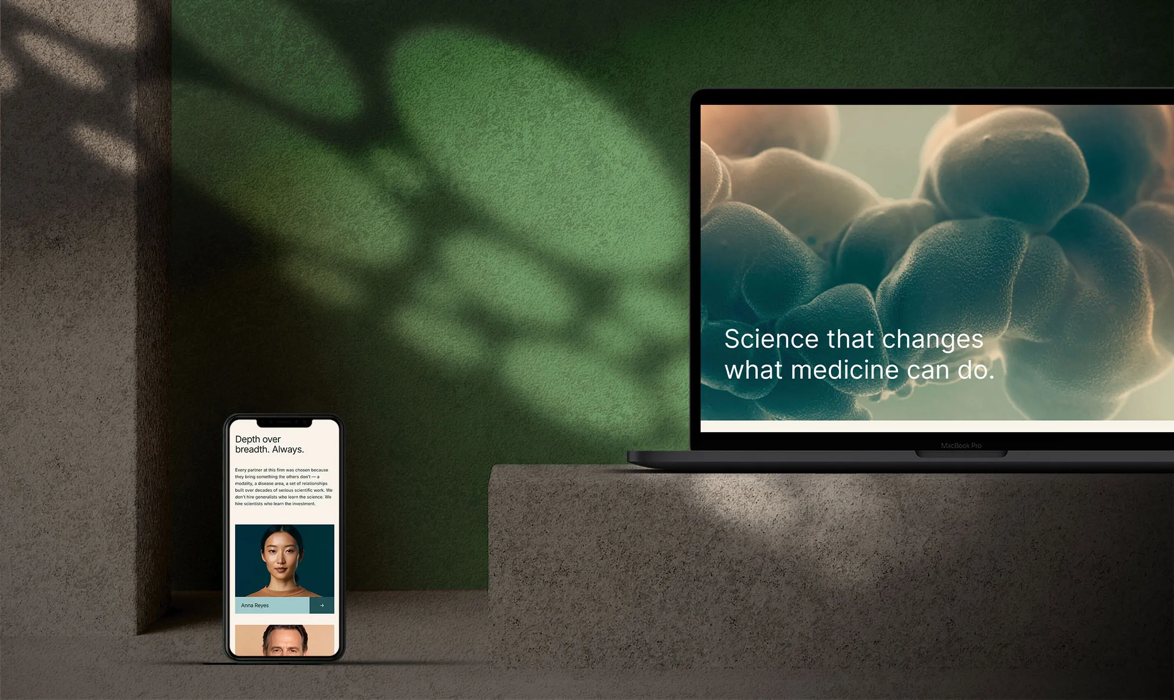
Our Squarespace templates give you a solid, credible starting point, with layouts designed around clear messaging, a straightforward user experience, and an obvious path to action.