Choosing colours for your website is about more than picking shades you personally like. The right palette can shape how visitors feel about your brand before they read a single word — calm and trustworthy, bold and energetic, warm and approachable.
The wrong palette can do the opposite. It can make a serious business feel unfinished, or a creative brand feel flat.
Here are 6 palettes that each create a different mood, along with the types of brands and websites they suit best.
1. Sage & Sand
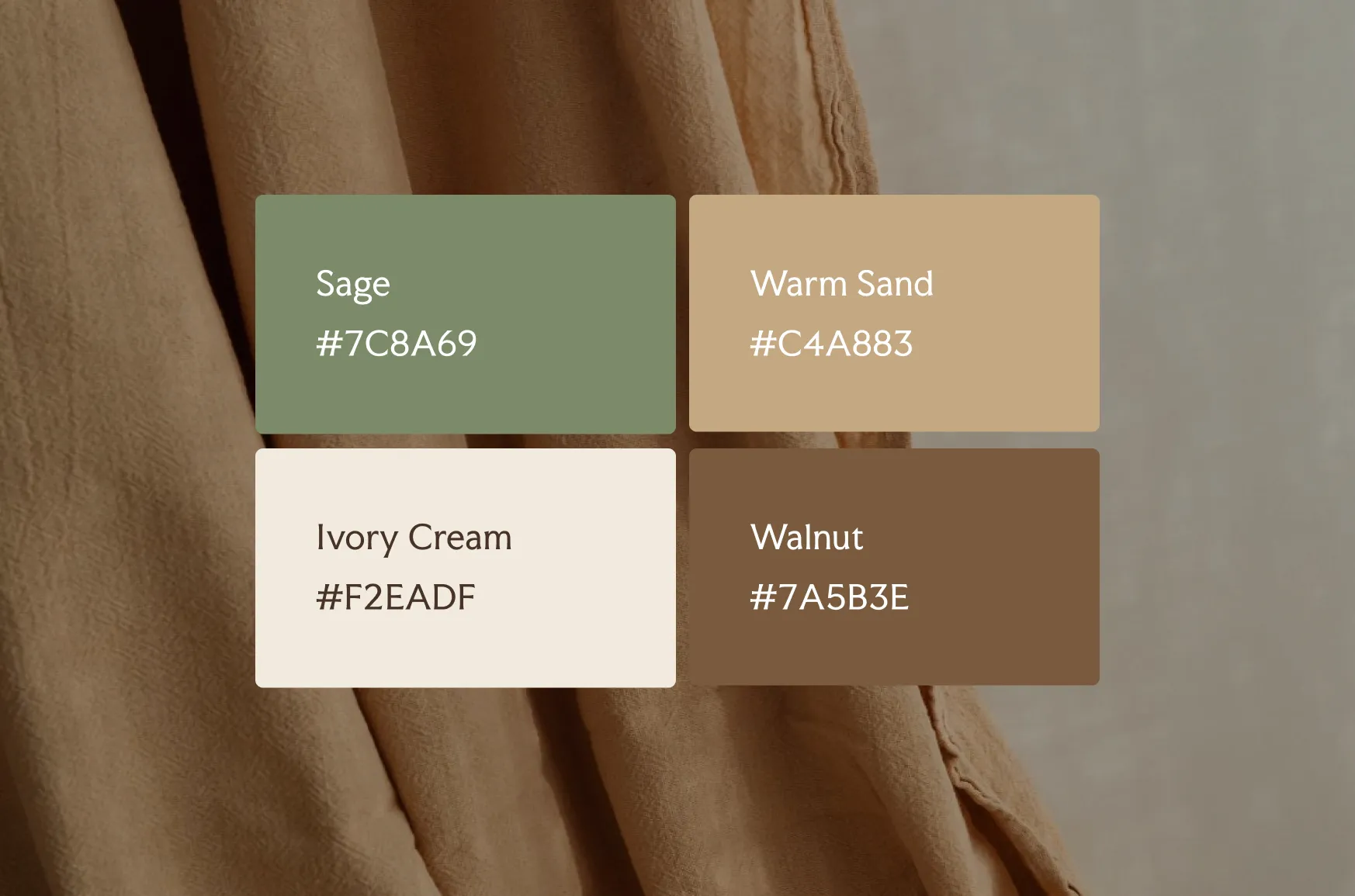
Colours:
- Sage: #7C8A69
- Warm Sand: #C4A883
- Ivory Cream: #F2EADF
- Walnut: #7A5B3E
Feel: Grounded, calm, trustworthy
Sage reads as steady and natural without tipping into “crunchy.” Warm sand and ivory cream keep the palette soft, while walnut grounds the lighter tones so text and details stay easy to read.
Best for: Wellness practices, therapists, coaches, and service businesses that want to feel calming and credible at the same time.
Why it works: Muted, low-contrast colours slow the eye down. Visitors read the site as considered rather than rushed.
2. Navy & Gold
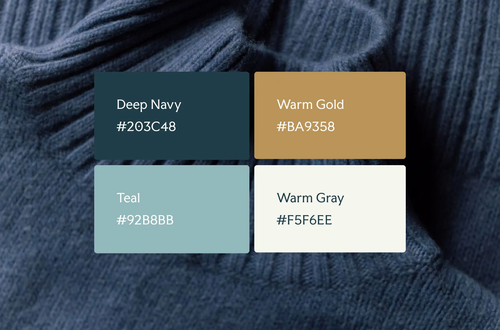
Colours:
- Deep Navy: #203C48
- Warm Gold: #BA9358
- Teal: #92B8BB
- Warm Grey: #F5F6EE
Feel: Established, confident, premium
Deep navy carries authority on its own, but paired with a warm gold accent, it feels considered rather than corporate. A soft teal adds a little life without competing, and warm grey keeps backgrounds from feeling heavy, so the palette stays readable even with a lot of text.
Best for: Financial services, legal and consulting practices, and any business where visitors need to trust you before they’ll book a call.
Why it works: Dark, saturated primary colours signal seriousness. The gold accent stops the palette from feeling stiff.
3. Terracotta & Clay
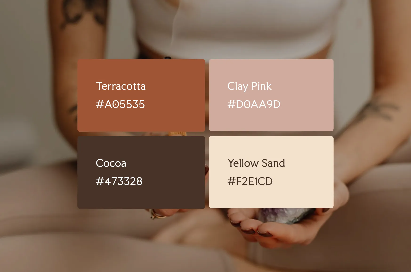
Colour Palette:
- Terracotta: #A05535
- Clay Pink: #D0AA9D
- Cocoa: #473328
- Yellow Sand: #F2E1CD
Feel: Warm, earthy, personal
This palette leans into warmth without becoming loud. Terracotta and clay pink feel handmade and human, while cocoa grounds the lighter tones so the overall effect stays sophisticated instead of pastel.
Best for: Interior designers, photographers, florists, and creative businesses that want to feel personal and approachable rather than polished to the point of generic.
Why it works: Warm, muted tones read as approachable. Nothing in this palette feels mass-produced.
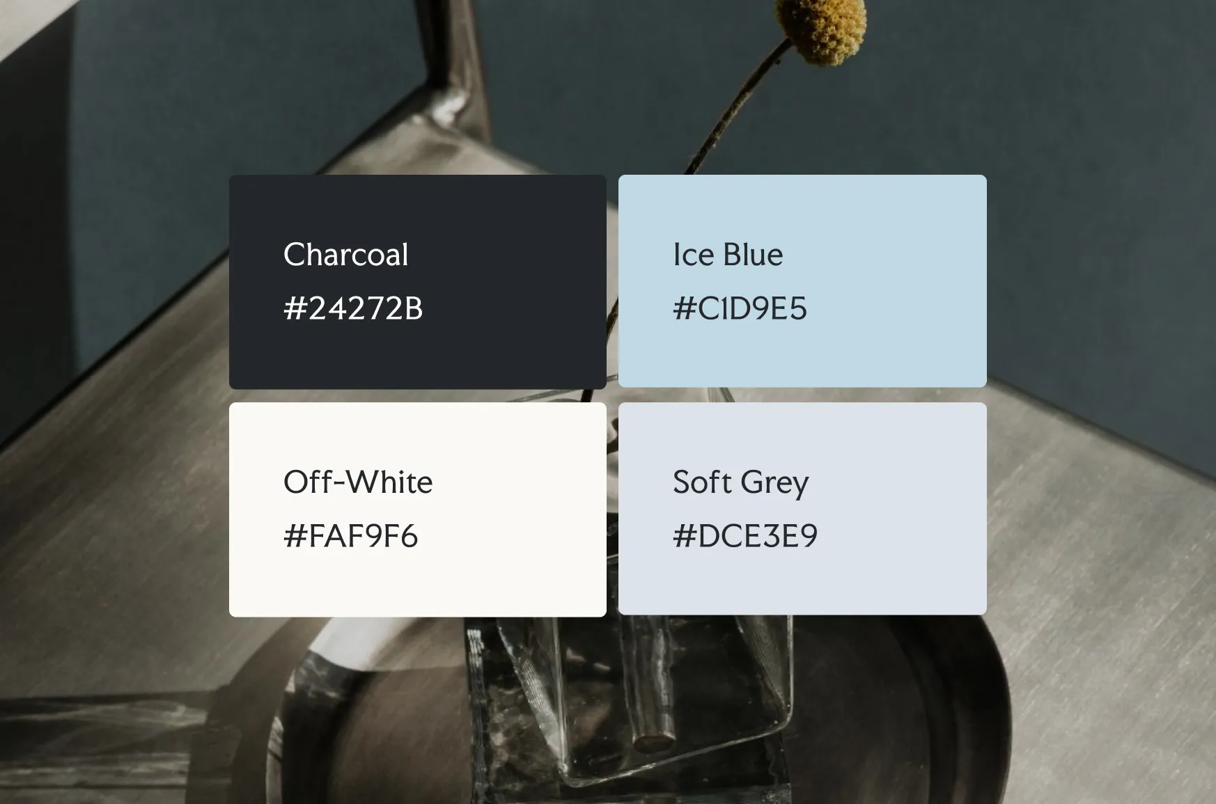
4. Charcoal & Ice Blue
Colours:
- Charcoal: #24272B
- Ice Blue: #C1D9E5
- Off-White: #FAF9F6
- Soft Grey: #DCE3E9
Feel: Modern, precise, minimal
A near-monochrome palette with one cool accent creates a lot of visual quiet, which lets typography and photography carry the design instead of colour. Ice blue keeps the palette from feeling cold or unfinished.
Best for: Technology, architecture, and design studios that want the work to be the focal point, not the colour scheme.
Why it works: Restraint reads as confidence. A brand that doesn’t need five colours to make an impression feels more in control.
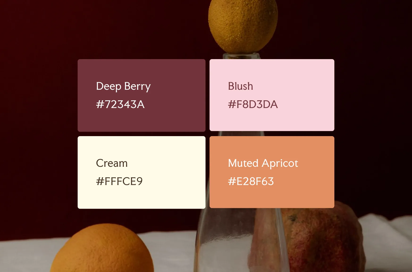
5. Berry & Blush
Colours:
- Deep Berry: #72343A
- Blush: #F8D3DA
- Cream: #FFFCE9
- Muted Apricot: #E28F63
Feel: Bold, feminine, distinctive
Deep berry does the heavy lifting here, giving the palette richness without relying on brighter, more generic pinks. Blush and cream soften it, and a touch of muted apricot adds warmth without pulling focus.
Best for: Beauty, fashion, and lifestyle brands that want to stand out in a crowded, visually similar niche.
Why it works: A single bold, saturated colour paired with a soft neutral creates contrast that feels intentional rather than chaotic.
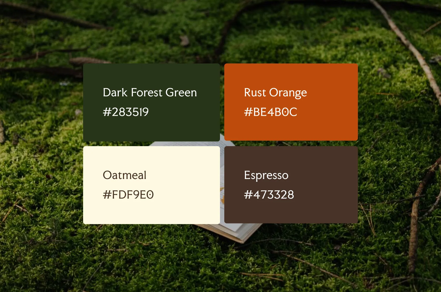
6. Forest & Rust
Colours:
- Dark Forest Green: #283519
- Rust Orange: #BE4B0C
- Oatmeal: #FDF9E0
- Espresso: #473328
Feel: Rich, seasonal, distinctive
Dark forest green and rust orange play off each other the way autumn foliage does, which gives the palette a lived-in, seasonal richness. Oatmeal keeps the background light enough for long-form content, and espresso handles text without needing pure black.
Best for: Home goods, food and beverage, and outdoor or lifestyle brands that want to feel rich and distinctive rather than trend-driven.
Why it works: Complementary warm and cool tones create depth without requiring a large colour palette.
Which palette is right for your brand?
There isn’t one universally correct palette — the right one depends on what you want a visitor to feel in the first five seconds on your site.
- Want calm and trustworthy? Try Sage & Sand.
- Want established and premium? Try Navy & Gold.
- Want warm and personal? Try Terracotta & Clay.
- Want modern and minimal? Try Charcoal & Ice Blue.
- Want bold and distinctive? Try Berry & Blush.
- Want rich and seasonal? Try Forest & Rust.
Test it before you commit
A palette that looks good in a mood board can behave differently once it’s actually on a page. Before you finalize anything:
- Check text contrast. Body text on a light background needs to stay easy to read, not just “on brand.”
- Look at it in daylight and at night. Screen brightness changes how saturated colours feel.
- Apply the 60-30-10 rule. One dominant colour, one supporting colour, one accent — used consistently — reads as intentional. Five colours used evenly reads as indecisive.
- Check it on mobile. Most visitors will meet your palette on a phone screen first, not a laptop.
Good colour isn’t about having options. It’s about picking one system and trusting it.
Your primary colour sets the tone, your secondary colour supports it, and your accent should be used sparingly enough that it still feels like an accent. The goal isn’t to showcase every shade you like — it’s to build a consistent system that makes your brand recognizable at a glance.
If you’d rather skip the trial and error, our Squarespace templates come with a tested colour system already built in, so you can focus on your content instead of second-guessing hex codes.