The demo looked great when you bought the template. The photos fit. The headlines sat neatly on one or two lines. Every section seemed to have just the right amount of breathing room.
Then you started replacing the demo content with your own stuff. Suddenly, a headline wraps onto three lines. A photo gets cropped in a weird place. One section looks cramped, even though you haven’t changed anything that seems important.
If that sounds familiar, you’re not doing anything wrong. This happens because the demo content was chosen to work with the layout in a very specific way. The good news is that you don’t have to rebuild the whole page to make your own content fit. A few simple habits will save you a lot of frustration.

First, remember that the demo content was designed to fit
Demo photos and text aren’t just placeholder filler.
The person who built the template probably chose relatively short headlines, specific image shapes, and certain amounts of text because they knew how those things would behave in the layout. For example, a four-word headline might look great in the demo because it stays on one line. Replace it with a fourteen-word headline and the same text block has to work much harder.
Images are similar. A landscape photo might look perfect in the demo because it happens to match the shape of the image block. Put a tall portrait photo in the same spot and Squarespace has to crop it. Once you start thinking of the demo as an example of what the layout expects, these changes make a lot more sense.
Before you start, duplicate the page
This one takes about ten seconds, and it’s the single most useful habit you can build here.
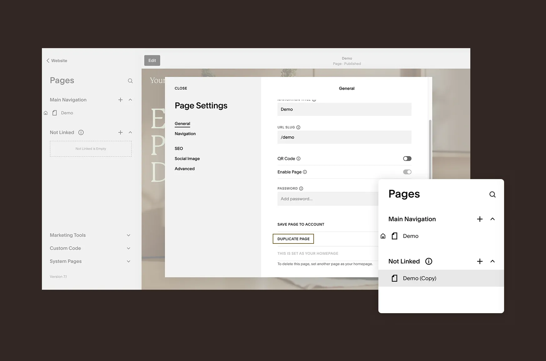
In the Pages panel, duplicate the page you’re going to work on, then make your changes on the copy. That gives you something to compare against if the page starts looking strange later.
It’s especially useful if you’re experimenting with sections or blocks. If you delete something and realize ten minutes later that you actually needed it, you can go back to the original instead of trying to remember how everything was set up.
Start with the text
Text is usually the easiest thing to replace.
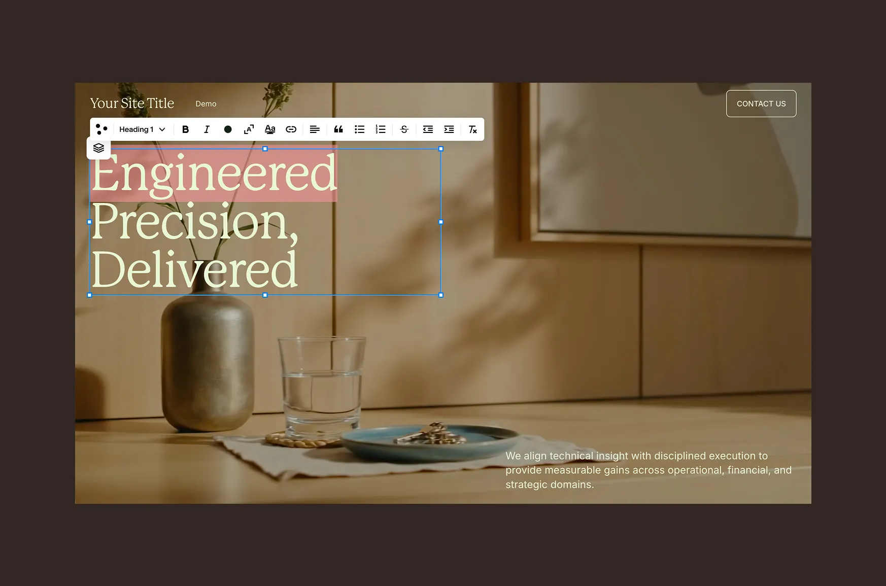
The main thing to watch is length, particularly for headings. If the demo says: “Made for slow mornings” and you replace it with: “A collection of handmade ceramics designed for slow mornings at home,” you’re asking the layout to do something quite different.
That doesn’t mean you can’t use the longer headline. Just expect it to wrap, and check what happens to the content underneath it.
If a heading is getting in the way, try shortening the wording before changing its font size. And avoid making a one-off font-size adjustment just to squeeze one heading onto a line. You’ll probably end up with one heading that looks slightly different from all the others.
If you genuinely want smaller headings across the site, that’s when Site Styles makes more sense.
💡 One other tip: edit the existing text block rather than deleting it and adding a new one. The existing block already has the spacing, formatting, and other settings from the template.
Then replace the images
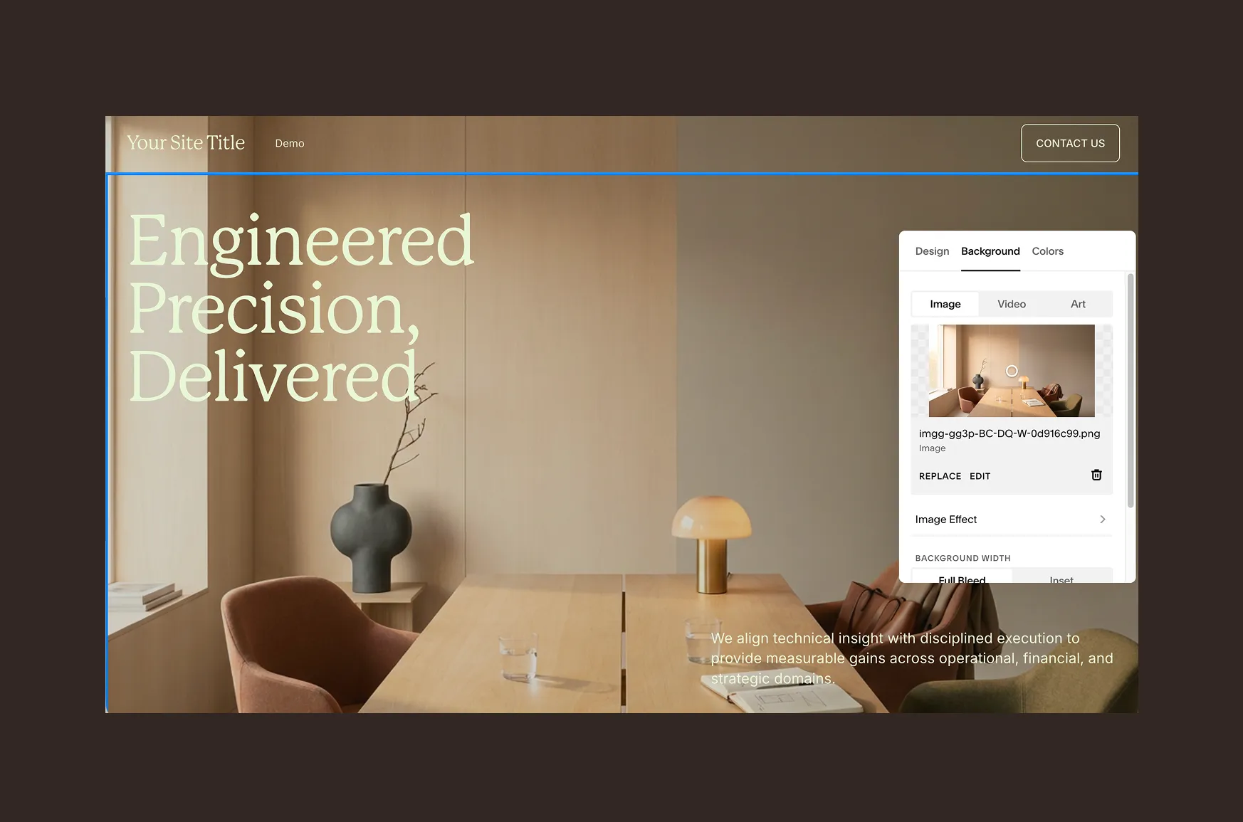
Images tend to cause more surprises because every photo is different. Start by looking at the shape of the existing image block.
- Is it wide and shallow?
- Nearly square?
- Tall?
Try to use an image with a similar aspect ratio. If the template uses a wide landscape image and you upload a tall portrait, Squarespace will crop it to fit. You might end up losing someone’s face, the product you’re trying to show, or the part of the photo that actually matters.
If the crop isn’t quite right, use Squarespace’s focal point tool. Move the focal point toward the part of the image you want to keep visible, then check the result at different screen sizes.
It’s also worth resizing large images before uploading them. You don’t need to upload a huge, uncompressed original just because you have one. Smaller, appropriately sized images can help keep the page from becoming unnecessarily heavy.
A few things I’d avoid
There are a couple of tempting fixes that can create more work later.
Don’t delete an entire section just because you don’t need one piece of demo content. If you’re unsure, remove or replace the content first and see how the section looks. You can always delete the section later.
Don’t start dragging blocks around until they “look right.” Fluid Engine gives you plenty of freedom to move things, but it’s surprisingly easy to knock other elements out of alignment. If something seems to have a very specific size or position, there may be a reason for it.
And don’t change one heading’s font size just to fix one awkward line. If the problem is the wording, fix the wording first.
Check the page on mobile
This is an easy one to skip, especially when you’ve been working on a desktop screen. Look at the page on mobile after you’ve made your changes. A headline that looks fine on your laptop may wrap differently on a phone. An image crop that works beautifully on desktop might suddenly cut off the important part of the photo.
Give the whole page a quick scroll rather than checking only the section you just edited.
You’ll catch things like:
- text overlapping another block
- buttons sitting in strange places
- images with awkward crops
- sections that suddenly feel too tight
- headings that have wrapped much further than expected
If you’ve kept your duplicated version, you can also compare the two pages side by side. That’s often the quickest way to spot what changed.
And if something still looks wrong…
You don’t have to figure everything out yourself. If you’ve replaced the content, checked the spacing, looked at mobile, and something still doesn’t behave the way you expect, there may be a setting or layout detail that’s easy to miss.
That’s a good point to ask for help rather than spending another hour dragging things around and hoping they eventually line up.