VC website design shapes the first impression a firm makes. Before a visitor explores your investment thesis or portfolio, the imagery, colour, typography and spacing already influence how established and credible the firm feels.
In our last post, we looked at structure: the three questions a visitor needs answered and the pages behind them. This post is about visual design. Here are five choices that help a biotech VC website feel considered and credible, shown with Nucleus, our Squarespace template for biotech and life sciences firms.
1. Use imagery that looks like science
A common mistake on a biotech site is generic business stock: handshakes, glass offices, people pointing at charts. It says nothing about your work.
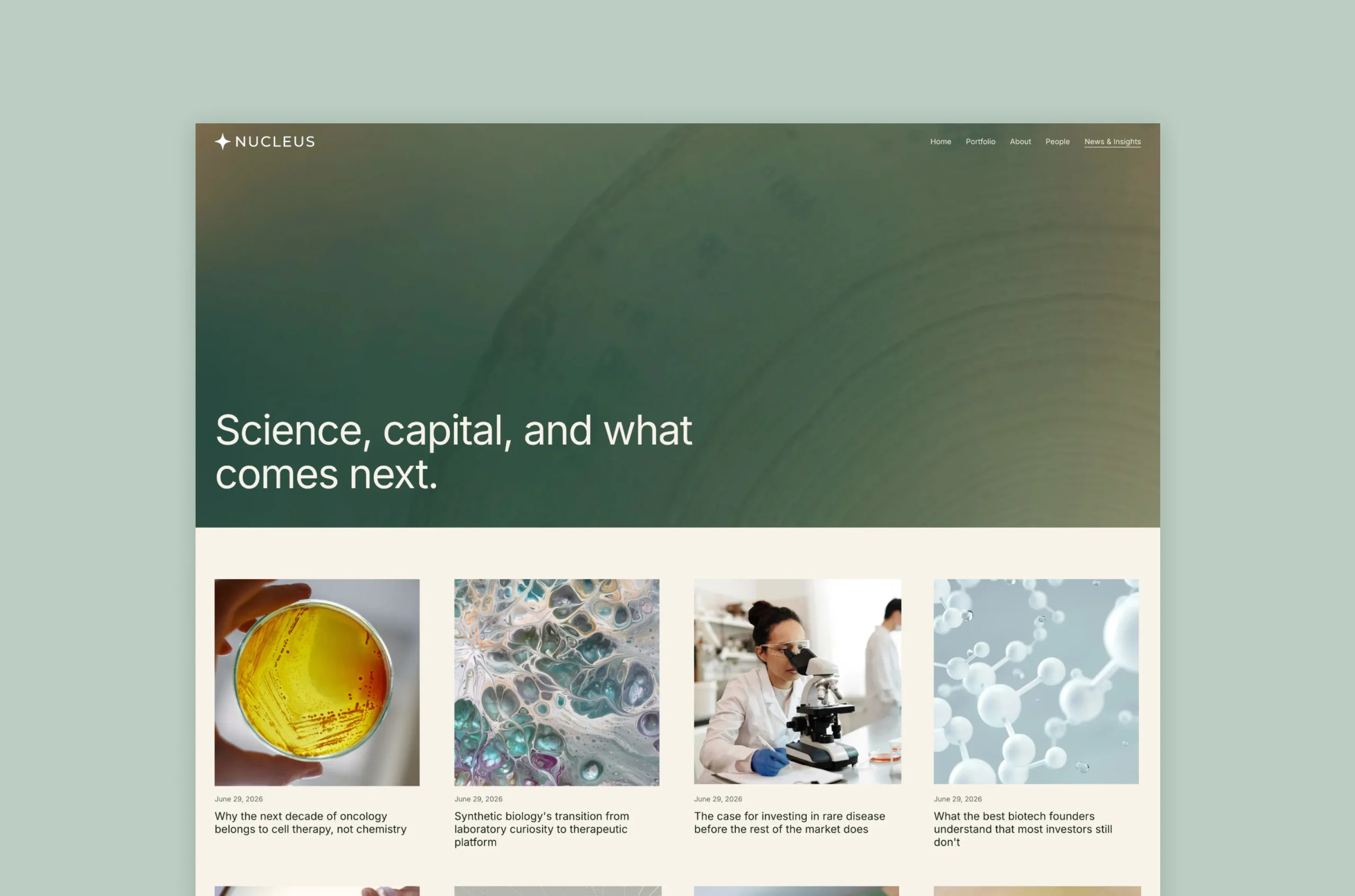
Choose imagery that reflects your investment focus. The Nucleus demo pairs its headline with a large, organic image that reads as scientific, then uses portraits on the people pages. One strong image per section is enough.
If you don’t have your own photography yet, choose scientific imagery that matches your focus. A considered image from your field is more convincing than a generic molecular illustration used because it looks scientific. Swap in real lab and team photos as soon as you can.
2. Keep the colour restrained
A credible site tends to feel calm. Start with a dark or neutral base, then pick one accent colour for the things you want noticed or clicked: buttons, key figures and links. If everything is highlighted, nothing is.
Let the palette reflect how you want to be seen. A research-led therapeutics investor and a platform-technology fund may reasonably want different tones.
Here is a quick test. Squint at the page. The accent should mark only a few places. If it appears everywhere, remove it from half of them. Our post on colour palettes for a standout Squarespace website has starting points.ose to the science.” It gives visitors who aren’t ready to reach out a low-pressure way to stay connected.
3. Pair type with a clear hierarchy
Type sets the tone. For a biotech VC firm, the aim is scientific seriousness that still feels approachable, like a modern investment firm and not an academic journal. A confident serif and a clean sans can both work, and the rule is the same for each: a clear step between the headline, the subheading and the body text, and body text that is easy to read.
Use two typefaces at most. Make the headline large enough to take in at a glance, and keep the body text dark enough against its background to read comfortably. Our font pairing tips cover specific combinations.
4. Give each section room
Space is one of the cheapest ways to look established. A crowded page looks anxious. A page with generous, consistent spacing looks confident.
Keep one idea per section, and leave the same amount of space between sections all the way down the page. Clear spacing also helps a visitor find your investment thesis, focus areas and portfolio companies quickly. In Squarespace’s Fluid Engine, lining your blocks up to the same grid lines makes this easier, because everything aligns without extra effort.
5. Make proof easy to verify
For a biotech VC firm, credibility comes from evidence, not just presentation. Portfolio companies, investment focus, team experience and relevant track record help a visitor understand what the firm actually does. Present a few meaningful figures instead of a dense list, and explain what each one represents. Keep portfolio logos at a consistent size and link them to the companies where appropriate. Pair founder testimonials with real names, roles and permission to publish.
The Nucleus homepage uses large figures, a logo row and short founder testimonials to show how these elements can work together. The demo content is illustrative, so replace it with verified information before you publish. Every figure and claim should be something you can substantiate if an investor asks.
Mistakes to avoid
- Stock photos that could belong to any industry.
- Generic molecular illustrations unrelated to your investment focus.
- Three or four accent colours competing for attention.
- Small, light grey text on a white background.
- Placeholder logos, figures or quotes left on the live site.
- Sections crammed with copy, so nothing stands out.
Where to start with VC website design
If you change one thing, start with imagery and colour. Those two set the tone fastest. Then check type and spacing, and finish with proof once you have real, verified information.
Start with a foundation built for biotech
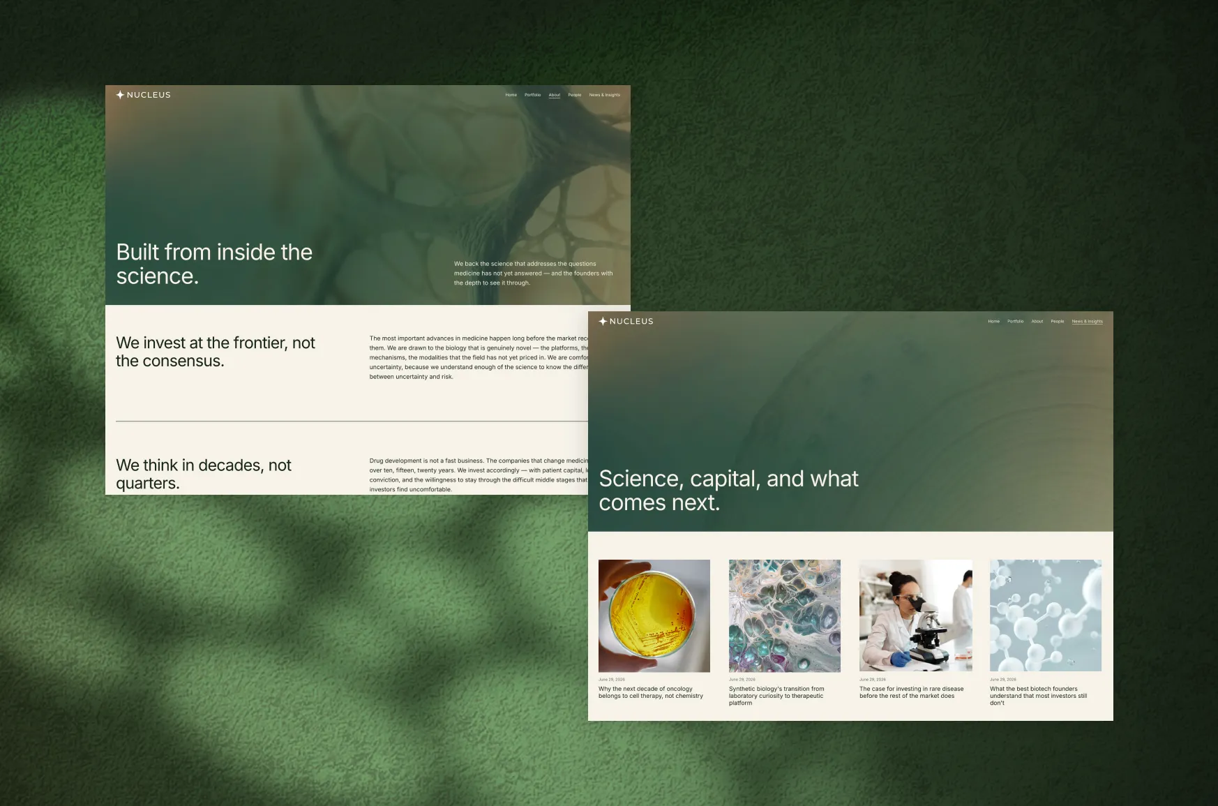
You don’t have to make every design decision from scratch. Nucleus gives biotech and life sciences firms a considered Squarespace starting point, with a structure and visual direction you can adapt to your own investment focus, portfolio, team and brand.