Someone hears about your business. Maybe from a referral, a LinkedIn post, a cold email you sent, or a quick search. Before they reply, book a call, or take the meeting, they do one thing first: they check your website.
That visit isn’t what convinces them to work with you. It’s what confirms, or quietly undermines, whatever made them curious in the first place. If your site feels vague, outdated, or unfinished, it doesn’t matter how strong your pitch was. People start doubting the pitch instead.
That’s a different job than most business owners assume their website is doing. It’s not there to close the deal from scratch. It’s there to hold up under a quick, skeptical look from someone deciding whether you’re worth a real conversation. And that look happens fast, often before you even know it’s happening.
Here’s what that actually requires, page by page: what to include, why it matters, and where people tend to get it wrong.

Home: pass the 10-second test
People move fast, especially the first time they land on your site. Assume your homepage gets ten seconds before someone decides whether to keep reading or close the tab. That’s not a lot of room, which is exactly why this page matters more than any other on your site.
In that time, your homepage needs to answer 3 questions:
- What does this business do?
- Who is it for?
- Does this look like an active, legitimate business?
If visitors have to scroll, click around, or decode your headline to figure those things out, you’re creating unnecessary friction.
✅ What this looks like when it’s working: A clear, specific sentence near the top of the page that says what you do and who you do it for, not just how you feel about doing it. Something like “Meal planning for busy parents who don’t have time to cook from scratch” tells a visitor exactly what they’re looking at. Compare that to “Helping people live better, healthier lives,” which sounds nice but doesn’t actually tell anyone anything.
❌ Where this tends to go wrong: The most common mistake is opening with vague, feel-good language that could describe almost any business in your industry. Phrases like “your trusted partner” or “taking your business to the next level” fill space without answering the actual question a visitor has, which is simply: what is this? Save your personality and deeper story for your about page. Your homepage’s job is orientation, not persuasion. Persuasion comes after someone understands what you do.
About/Services: clear before it’s impressive
Once someone understands what you do, this is the page where they decide whether you’re the right fit, or whether you’re just another version of everyone else offering something similar.
This matters because vague credibility doesn’t actually build trust. Anyone can say they’re experienced or detail-oriented. What convinces someone is specificity: knowing exactly what problem you solve, for exactly which kind of client, and why your approach makes sense.
✅ What this looks like when it’s working: A strong about or services page names the actual problem you solve, explains your approach in plain language, and is specific about who you work with best. It also includes enough detail that someone in your industry would recognize you know what you’re talking about, without requiring the reader to already be an expert to follow along.
❌ Where this tends to go wrong: Business owners tend to overcorrect in one of two directions. Either the page stays so general that it says nothing specific, essentially repeating the homepage in different words. Or it goes the opposite way, filling the page with dense industry language, acronyms, and technical detail that only someone already in your field could follow. Both versions fail the same test: a genuinely interested but unfamiliar reader should walk away understanding what makes you a good fit for them, specifically. If someone needs more technical depth than your website provides, that’s what a discovery call or proposal is for. Your website’s job is to earn that conversation, not replace it.
Team: this matters more than owners expect
People aren’t only evaluating what you offer. They’re evaluating who’s behind it, especially with smaller businesses, where the relationship often matters as much as the service itself. This is doubly true for any business where someone is trusting you with something important, whether that’s their money, their health, their time, or their brand.
A team page isn’t just a formality. It’s often where hesitation turns into confidence, because it answers a question every visitor is quietly asking: is this person or team actually qualified to do what they’re claiming?
✅ What this looks like when it’s working: A team page that shows relevant background and experience, without reading like a full resume. If credentials or certifications matter in your field, like a certification, license, or specific training relevant to what you do, they should be easy to find, not buried in a paragraph. The goal is to give a visitor just enough context to feel confident, quickly.
❌ Where this tends to go wrong: Two common mistakes here. The first is padding the page to look more established than you are, adding vague team titles or stock photography to suggest a bigger operation than you actually have. This usually backfires, since people are good at sensing when something feels inflated, and it works against the very trust you’re trying to build. The second mistake is the opposite: leaving the page thin or generic, with no real sense of who’s behind the business. If it’s just you right now, that’s completely fine. Be specific and honest about your background rather than either overselling or underselling it.
Proof: show you’ve actually done this before
People don’t just want to hear that you’re good at what you do. They want to see evidence of it. This is often the single biggest gap between websites that convert and websites that just sit there looking professional.
Proof matters because it shifts the burden of belief. Instead of asking a visitor to trust your word, you’re showing them something concrete: this is what happened when someone else worked with you.
✅ What this looks like when it’s working: A few strong client testimonials, specific enough that they don’t sound generic. A short case study describing a real challenge, what you did, and the outcome. Logos of businesses you’ve worked with, if you’re able to share them. Concrete markers like years in business or number of clients served. Even one or two of these elements can meaningfully shift how credible your site feels.
❌ Where this tends to go wrong: The most common issue is simply skipping this section entirely, describing your capabilities without ever showing that you’ve actually delivered on them. The second most common issue is using proof that’s too vague to matter, like a testimonial that just says “Great to work with!” without any specifics. A testimonial that mentions what the client’s actual problem was, and how it was solved, does far more work than a generic compliment.
Contact: don’t make anyone hunt
This sounds obvious, but it’s one of the most common gaps we see, even on otherwise well-built websites. If someone’s interested enough to want to reach you, the path to doing that needs to be immediate and obvious, not something they have to search for.
This matters because interest is often short-lived. Someone might feel ready to reach out right now, while reading your about page or looking at your proof section, and if there’s friction between that feeling and actually contacting you, some percentage of those people simply won’t follow through.
✅ What this looks like when it’s working: A clear way to take action from nearly any page on your site, whether that’s a booking link, a short contact form, or a visible email address. The simpler the better. You’re not trying to capture a lot of information upfront. You’re trying to remove any reason for someone to hesitate or postpone.
❌ Where this tends to go wrong: Contact information that only lives on a dedicated Contact page, several clicks away from where someone’s interest was actually building. Long, complicated contact forms that ask for more information than necessary before someone can even send a message. Both create unnecessary friction at exactly the moment you want the least friction possible.
What you probably don’t need yet
Just as important as knowing what to include is knowing what you can reasonably leave out, especially in the early stages of a business. Trying to build everything at once is one of the fastest ways to delay actually launching.
✅ What this looks like when it’s working: A focused site with four or five strong pages that clearly communicate what you do, who it’s for, and how to reach you. That’s genuinely enough for most small businesses and early-stage companies to start building trust and generating conversations.
❌ Where this tends to go wrong: Founders often assume they need a fully built-out blog, elaborate custom animations, a dozen pages of content, or a design that makes a five-person company look like a fifty-person one. None of this is necessary early on, and some of it can actively work against you. Most people evaluating a small business or startup already expect exactly that: a small, growing business. What they’re checking isn’t how large or polished your site looks. It’s whether it’s clear, honest, and gives them what they need to make a decision.
A quick pre-meeting check
Before your next important call, pitch, referral, or introduction, look at your own website as if you’ve never seen it before.
Ask yourself:
- Could someone unfamiliar with my business understand what I do within a few seconds of landing on the homepage?
- Does my About or Services page explain what I do and how I approach it without requiring insider knowledge?
- Does my Team page accurately show who’s behind the business and why they’re qualified?
- Can visitors see evidence that I’ve actually done this work before?
- Can someone figure out how to contact me without having to hunt for it?
If you can honestly answer yes to all five, your website is doing its job. If a few of these gave you pause, you now know exactly where to start.
Getting there without losing months
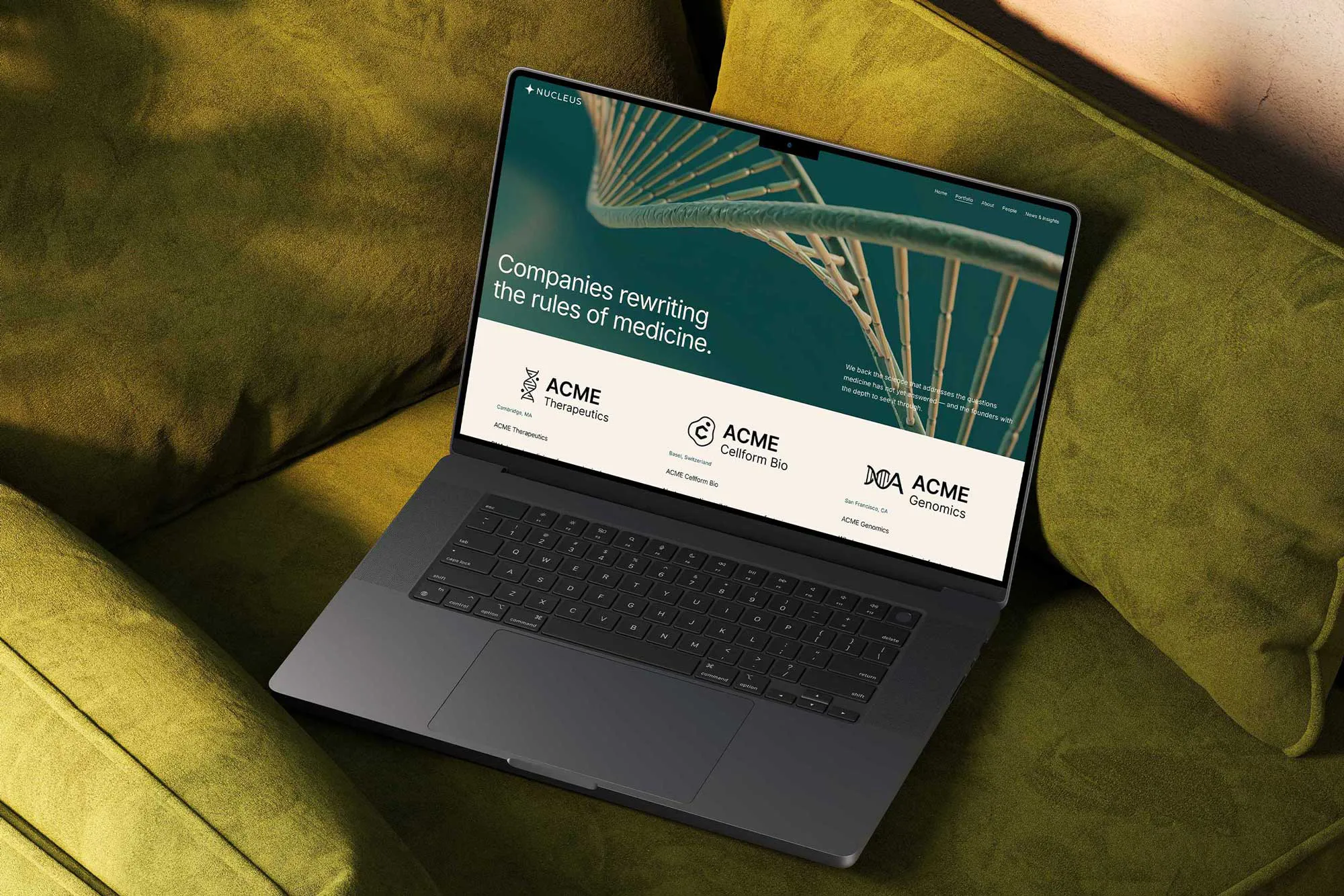
None of this requires a custom-built site or a lengthy design process. It requires the right structure, built around what the people checking you out are actually looking for, page by page.
That’s the gap a good template can close: a starting point already shaped around what a growing business needs to communicate, so you can focus your time on the work instead of figuring out your sitemap from scratch.