This is probably the question we hear most often from people thinking about buying a template. It’s a reasonable concern. If 100 people can buy the same design, there’s always a chance two websites could end up looking pretty similar
But buying a template doesn’t mean you’re getting a finished website. It’s really just the foundation. The photos you use, the way you write about your business, the fonts, colours, spacing, and all the little details you change along the way are what make it yours.
Here’s what we tell our own customers.
What actually makes a site feel generic
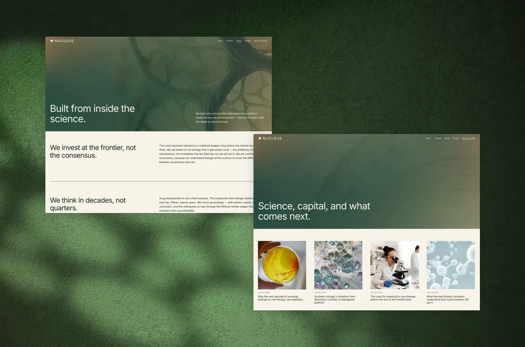
Usually not the layout. Almost every “this looks like a template” reaction traces back to three things left untouched: the default fonts, the default colours, and the demo photography. Those three are doing nearly all the identifying work, since they’re the first things a visitor’s eye picks up, and also the things people are least likely to change, because honestly, the defaults already look fine.
That’s the actual trap. Squarespace’s default styling is genuinely good-looking, which is exactly why so many sites end up looking alike. Dozens of other people saw the same attractive defaults and made the same reasonable call not to touch them.
Fonts and colours do more of the work than you think
Swapping in your own font pairing and colour palette changes a template’s whole feel without touching a single layout block. It’s the highest-impact move available, and also the one people most underestimate.
We’ve written full guides on both if you want to go deeper: 6 font pairing tips for a standout Squarespace website and 6 colour palettes for a standout Squarespace website walk through specific combinations and the mood each one creates.
Picking the wrong colours isn’t really the risk here. Picking colours or fonts that don’t say anything about your business specifically is. A sage green palette and a confident serif headline are both fine choices on their own, but if you picked them because they looked pleasant in the preview rather than because they fit your brand, you’ve dressed the template up, not made it yours.
There’s a second trap, and it’s a subtler one. We worked with a client who swapped a template’s original serif, which gave the site a refined, editorial feel, for her brand’s sans-serif. Reasonable move, it was her actual brand font. She kept it at roughly the same size the serif had been set at though, sized for a completely different typeface’s proportions. The pages got heavier, not more personal, and the editorial quality that sold her on the template in the first place quietly disappeared along with it.
Your own fonts are still the right call. Just don’t treat the swap as one-for-one. A template’s type sizes and spacing were calibrated around its original typeface specifically, so bringing in your own almost always needs a second pass on size and spacing too, not just a drop-in replacement.
Your photos might be giving the template away
Photos are one of the biggest giveaways that a website is made using templates, and at the same time one of the hardest elements to overlook. Templates provide generic images which are visually pleasing but would fit practically any company.
However, there is no need to organize a professional photo shoot to get out of this. Just a couple of well-lit pictures of your products or space, or employees, will work much better than generic pictures most of the time. It’s not hard for people to distinguish a generic picture from a unique one, even if they cannot explain why.
No pictures to begin with? That’s a problem worth working on instead of covering it up. A text-led hero or simpler layout is usually better than filling the space with stock images that make the site feel less personal.
The smaller choices that finish the job
Once the fonts, colours, and photos are sorted, there are a handful of smaller changes that help the site feel finished.
Look at your buttons. Are they rounded because that’s what the template came with, or because rounded buttons actually suit your brand? Would an outline work better than a filled button?
Check your links, your spacing, and the order of your sections. You don’t necessarily need to redesign a page. Sometimes moving one section higher or giving another a little more breathing room changes the whole feel.
And then there are icons. If you’ve spent enough time looking at Squarespace sites, you start to recognize the familiar icon sets. Swapping those out for something that fits your brand better — or using a small custom graphic, like your logo mark as a section divider — can make a surprisingly big difference. None of this requires you to become a designer.
Go through the site once, slowly. When you come across something, ask yourself: Did we choose this, or did the template choose it for us? That question alone will uncover quite a few things worth changing.
You don’t need a redesign
Worth saying plainly: no custom code, no developer, no rebuild required. We sometimes see template buyers overcorrect toward exactly that, hours spent hacking together layouts Squarespace was never built for, when the real fix was already sitting in the built-in styling tools.
Nobody’s asking your site to look nothing like a template. Just that the parts a visitor actually notices, colours, fonts, photos, a handful of small details, are yours instead of the defaults.
A quick self-check
Before calling a template done, walk through your site and ask:
- Have I changed the fonts and colours from the defaults, and do they reflect my brand rather than just what looked nice in the preview, sizing included, now that the typeface has changed?
- Have I replaced the demo photography with real photos, even simple ones?
- Have I looked at button styles, spacing, and icons, or left them exactly as they came?
- If I removed my logo, could a visitor still tell this site apart from the template’s live demo?
A “no” on that last one doesn’t mean the template was a bad choice. It usually just means a few defaults are still sitting there untouched.
Pick a template that leaves you room to work with
This is worth thinking about before you buy, too.
Some templates make this easier than others. When you’re choosing one in the first place, look for a structure flexible enough that font, colour, and photo changes can genuinely transform its feel, not one so heavily styled around a specific look that even the basics leave it looking like the demo.
That’s deliberate in our own templates: a strong foundation, but with real room left for your fonts, colours, and photography to actually do the work of making it yours.